March 3, 2011

|something slightly different: louboutin different|

Being a female, I have the natural obsession with shoes. More specifically, I have an obsession with heels, classic in style more often than not, and very expensive taste. And so, as a special birthday approaches, I decided I'd research into the financials of the Christian Louboutin shoe, made ever so famous by the numerous celebrity customers and of course, the red sole. This post is going to end in disappointment, rather than excitement, which has bubbled through me for the last 24 optimistic hours. 

As I began searching, I came across more than one site offering Louboutin shoes for remarkable prices; little over 100 pounds, and the excitement started to grow. 100 pounds was more than affordable. However, when I settled down and began looking into the site reviews, I discovered that little over a two years ago, various scams hit the internet, claiming to sell original, hand crafted Louboutins with nothing less than a 50% discount. The sites look real, they have pages and pages of shoes, copyright dates at the bottom of the page (which are recent), free shipping etc etc. Only someone that truly sat down to look a little further would have realised the grammatical errors that the information pages were ridden with; that there weren't telephone numbers in sight, only contact via email and tiny other hints to the fact that the page was fake. First and foremost, grammatical errors and contact details should be dead give aways as to whether a site is fake or not.

Doing further research, I discovered some of these articles, confirming what I feared...my excitement was too good to be true. 


I would love spend the R5000-00 odd rands on these gorgeous shoes, but unfortunately, I have more important things to think about spending that kind of money on. These sites showcase the real deal as far as images are concerned, but on taking delivery, you will discover that they are knock-offs and complete fakes. The site that I was on was www.christianlouboutinuk.uk.com. They even made an error in spelling Louboutin, "Louboution". 

Anyway, as my hopes have now been slashed, I just thought it a good idea to make it known to all the other shoe lovers out there. And should you wish to look and revel at the authentic site with sky high prices, it's www.christianlouboutin.com.

February 27, 2011

| discovering style in year two |

And so on the 24th of January 2011, AAA recommenced it's school term, as usual, ever so much earlier than other tertiary institutions. And bang, we dove in, head first and not really knowing if we were coming or going. You see, second year is the year of the ever so illusive computer, more specifically, the jump to the Apple Mac, and very few students are accustomed to the workings of these wondrous creatures after surviving a first year of working everything by hand. So, they briefed us on what is to be a brief that will continue throughout the first term, culminating on April one [my birthday-hip hip horray]. 

Our brief initially required us to write a research essay outlining the design elements of our most weird and wonderful museum shop. We had several types of shops to choose from, I chose the hoax museum and streamlined it to April Fool's Hoaxes. Along with the research essay came the task of learning how to manipulate Adobe InDesign to your every command- as we all know, computers sometimes have a mind of their own, and only if you stroke them and talk to them nicely, will they co-operate. Adobe Illustrator was also on the cards, and so the hours began. However, along the 18th Century European research path that I chose, I stumbled across some beautiful images that were to inspire the style of my shop. The shop is meant to have an eighteenth century neo classical (new classical) design approach, with a more classic modern touch. Thus, incorporating light colour palettes and the beautiful blues that enriched the era, I began my design inspiration. Florals and stripes are also prominent features for this time period, which suite my actual taste so wonderfully, that I enjoyed the image research. Enough babbling, here they are (please note that these photos have been found on blogs, museum sites and the like, and are not my own):


This glass feature is beautiful

Designed by Pentagram, Corporate ID is so elegant

A beautiful French store front
Packaging, also designed by Pentagram


Illustration reminiscent of the French style. The colours and type are a perfect fit.


This logo, designed by WeMadeThis, has exquisite graphic elements.
The colours are also elegant and classic, yet grasp the modern atmosphere.


Ah, and it comes down to the one and only typeface, Bodoni. Ironically, it comes freshly designed straight out of the eighteenth century, so I didn't have to do much persuading.
The combination of styles of the typeface is an example of how different line weights can be incorporated into design.

Another packaging design from Pentagram

Gorgeous soap packaging that captures the mood beautifully.


I stumbled upon this just before hand in, and what a lovely discovery.

Typical eighteenth century room decor. I could do with a little less
gold, but the style is beautiful on its' own.
Beautiful eighteenth century pattern design, found on the V&A Museum Website.


And, the perfect store front for the museum, which had been placed in Britain.


We have just finished designing the logo, forcing us to delve even deeper into the world of Illustrator, but learning the ropes is very rewarding when the finished product is produced. Next up, we'll be designing signage and posters as well as packaging for some of the crazy weird products that shall engross the shelves of our mysterious shops. One of these days, I'll be a Adobe wizz, until then, I'll claim ignorance and fear.

October 30, 2010

| brush in hand |


This post is going to contain some of my make up work, which is few and far between at the moment because I have focused all of my attentions on my current degree. However, I do have some interesting pictures from some of the work I did last year and a couple of experiments that I have dabbled in this year. I've decided that all posts related to make-up and hair styling will be in a different typeface, in order to distinguish between the disciplines. 


This was done with photographer Mark Freebs for a personal porfolio.

Model: Jenna Upton
Make Up & Hair: Amy Olivia
Photographer: Mark Freebs


Model: Christina Lubushagne
Hair & Make Up: Amy Olivia
Photographer: Matthew Schrire


Kirsten Bing
Springfield Matric Dance 2010
Hair & Make Up: Amy Olivia


Model: Megan Petrie
Hair: Tandem Constantia
Make Up: Amy Olivia


 Thats that for now. I have a couple shoots coming up, so I will be sure to add some more. I also have editing to complete on other photographs, so those will be joining this lot.

| zine infested |

For our final brief for the semester we had to create a zine. What is a zine? A zine is a less-influenced-by-popular-culture-conventions form of a magazine. It's purpose it to advertise you as a person, agency, organization in any way you see fit. It is generally something that is put together in a format that is as cheap as possible and then photocopied and distributed as need be.

We were briefed with the task of creating a zine in a group that was metaphorically a design agency, had it been in the "real world". We had to come up with an agency name for our design agency, use a specific theme and run with it throughout "issue one" of our zine.

My "design agency" came up with the name Flint, the conceptual link behind it being that we are instigators of great things. After a long process of finding the right way to conceptually design our zine, we arrived at the ever so marvelous point of using lemon juice to write secret messages on the paper. People would then have to hold a flame underneath the page to reveal the message. Therefore, when you received our zine, you would receive a "blank" book with a box of matches. We decided to go with the theme: a world ruled by designers. We put our own spin on it and altered it to read LITTLE TRADE SECRETS IN A WORLD RULED BY DESIGNERS. 

Below are some pictures of the already burnt book, we had to hand in one blank one and one already "burnt".


This is the front cover [we named our zine issue one HUSH HUSH to extend the concept]

Page One: The theme page [designed by Adeline van Eck]

Page Two: Design Secret One [designed by Natalie Retief]

Page Three: Design Secret Two [designed by Adeline van Eck]


Page Four: Design Secret Three [designed by Lara Heley]


Page Five: Design Secret Four [designed by Amy Soule (me)]


Page SIx: Design Secret Five [designed by Genevieve Chorn ]


We thought it came out pretty well, and I am so glad I got to steal Adeline's camera to take some decent photos for a change.


So long.

October 28, 2010

|something that I covert|

As I might have mentioned, I was a serious dancer for 12 years of my very short life, towards the end, it became very intense, to a point where I would have been professional (by South African Standards) if I had been paid and was part of a company. Anyway, I had to make some choices and ended up giving it up in 2008. Over the past two years I really have missed it and regret the choice indefinitely.

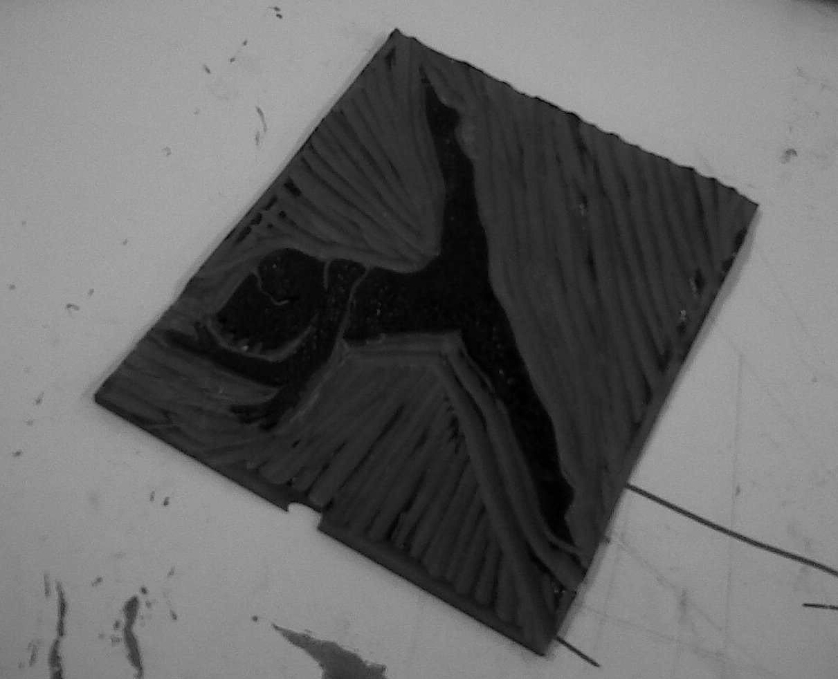
However, what has this got to do with this post? We had to dabble in the art of printing methods but with two colours. I choose to go the route of Lino cutting. Our theme was: something that you covert. Hence, that's where the dancing comes in.

Here are some of the images from my process. (Please excuse the hideous picture quality, I am in between camera's right now)


This is a series of dancers. I found inspiration in images that were taken of a good friend that I used to dance with, Mila de Biaggi.


These are the final prints in the various colours and layouts that I experimented with.


The above blocks are the printing blocks. You have to carve away the surrounding negative space in order to be left with the image that you want to print.


The final product.


I enjoyed working with this medium. It was definitely something different for me and, in my personal opinion, I really like the way that they turned out.

September 16, 2010

|to maintain a healthy level of insanity|

Something that I found pinned to my bookshelf. Here's to laughter being the best medicine:


  1. At lunch time, sit in your parked car with sunglasses on and point a hair dryer at passing cars. See if they slow down.
  2. Page yourself over the intercom. Don't disguise your voice.
  3. Everytime someone asks you to do something, ask if they want fries with that.
  4. Put decaf in the coffee maker for 3 weeks. Once everyone has gotten over their caffeine addictions, switch to espresso.
  5. In all the counterfoils of your cheque book, write "for marijuana."
  6. Skip down the hall rather than walk and see how many looks you get.
  7. Order a diet water whenever you go out to eat, with a serious face.
  8. Specify that your drive-through order is "to go."
  9. Sing along at the opera
  10. Five days in advance, tell your friends you can't attend their party because you have a headache.
  11. When the money comes out the ATM, scream "I won, I won!"
  12. When leaving the zoo, start running towards the parking lot, yelling "Run for your lives! They're loose."
  13. Tell your children over dinner, "Due to the economy, we are going to have to let one of you go."
  14. Pick up a box of condoms at the pharmacy, go to the counter and ask where the fitting room is.
I hope you laughed. xoxo

September 13, 2010

| bodoni love affair |

I thought it would be a nice idea to add some of the work that I've worked on during my first year at AAA. Bare in mind when you're taking a look see that all the type, imagery and basically everything is hand rendered, traced or drawn. Painstakingly I sit every Thursday night before deadlines, hand tracing qualifying lines and logos, pay off lines etc. Though, I have found a strange love for letters and typography in particular. One typeface (note non creatives: typeface; not font) that I have absolutely fallen in love with is a serif typeface called Bodoni, existing way back when block printing was still being used. Unfortunately, I have to bow down to Helvetica and Gill Sans every once in a while, but my love affair will still continue with Bodoni.


This is one of the first logos that we designed with an emblem. Mine was for an elegant country farmstall. The typeface is Bodoni, incase there was doubt.


This is a t-shirt design that was designed for an environmentally friendly company. 
"No Ice. No Life."


This was a skills brief when we first started working on typography. We had to create a type monster.


This is not the finished product, but basically we had to build a 3D object and apply a pattern that we designed earlier on in the year. The concepts obviously had to fit.

I can't really seem to find the rest of the works right now, some of them haven't been photographed yet, but they will be at the end of year exhibition, and then I'll be sure to add them.

Unfortunately, I can't go into too much depth about what it is that the concepts are or the specifications for the brief, as other schools steal, and ad agencies who are cheap, steal too. It's a shocking world. 

I promise, there is some more stuff that is far more intriguing than these, but this was all I could find for now. At the moment, we're working on corporate identity. I'm quite enjoying it.